WHO Mortality Database
A visual summary
Mortality data is not just about those we have lost, it is about the living, too. As the COVID-19 pandemic has shown, counting the people who die – and how they die – is fundamental to global health. And, as WHO’s Dr Samira Asma adds, “Mortality statistics are a mirror of population health.”
Good public health decision-making depends on good mortality data. It is used to measure progress towards WHO’s Triple Billion targets and the health-related Sustainable Development Goals (SDGs). And it informs our response to health emergencies.
Since its founding in 1948, the WHO has mandated that all Member States report mortality data. COVID-19 is a stark reminder of exactly why.
During the pandemic, public health decision-makers urgently needed information on mortality and causes of death to allocate resources, design policies, and inform populations. The primary source of this data is Civil Registration and Vital Statistics (CRVS) systems, which register all births and deaths, issue birth and death certificates, and compile vital statistics including cause-of-death information.
Countries with well-functioning CRVS systems were able to quickly identify unexpected increases in mortality beyond those normally observed over similar periods of time, otherwise known as excess mortality. In contrast, those without strong CRVS systems lacked critical knowledge to make timely and informed decisions.
The pandemic highlighted the degree to which mortality data – and the ability to make use of it – impacts our understanding and response planning.
This is why the launch of a new portal for the WHO Mortality Database in April 2022 is such a critical resource for Member States and researchers. For the past seven decades, the WHO Mortality Database has been the leading source of data for comparative epidemiological studies of mortality by cause. However, WHO’s new portal will give this data unprecedented impact, accessibility and relevance.

Geneva, 1948. A plenary meeting at the First World Health Assembly, attended by 53 of WHO’s 55 Member States, as well as nine countries not yet members.
A brief history of mortality data
Improved accessibility to the WHO Mortality Database will be another significant step forward in a journey that began almost 130 years ago.
In 1893, the International List of Causes of Death was the first major milestone in collecting and standardizing mortality data. Adopted by the International Statistical Institute, “The List” would eventually become the regularly revised International Classification of Diseases. The latest revision, ICD-11, was adopted by the 72nd World Health Assembly in 2019 and officially came into effect on 1 January 2022.
Emerging epidemics in the early 20th-century spurred the world’s efforts to gather information from countries to support epidemiological research. Yet throughout most of the last century, this data remained sparse. In 1971, WHO’s first World Health Statistics report contained cause-of-death data for 53 Member States, representing just 24% of the world’s population and less than 1% of Africa’s.
Number of countries and areas in the WHO Mortality Database
As of April 2022

Note: Typical lag of 18-24 months before Member States report finalized data. Therefore, reporting for the most recent years has not decreased and data from the latest ICD revision (ICD-11) is yet to be reflected in the data.
ICD adoption dates: ICD-7 (1956), ICD-8 (1966), ICD-9 (1976), ICD-10 (1990), ICD-11 (2019).
But progress was aided by advances in technology. In the late 1970s, data was submitted by countries via magnetic tapes, which allowed for some automation in data processing. This eventually led to the WHO Mortality Database being published online in 1999.
For the first time, scientists and academics around the world could freely download an international series of cause-of-death data from 1950 onwards to support their research. This database underpinned core research and contributed to the development of health policies and improvements in population health.

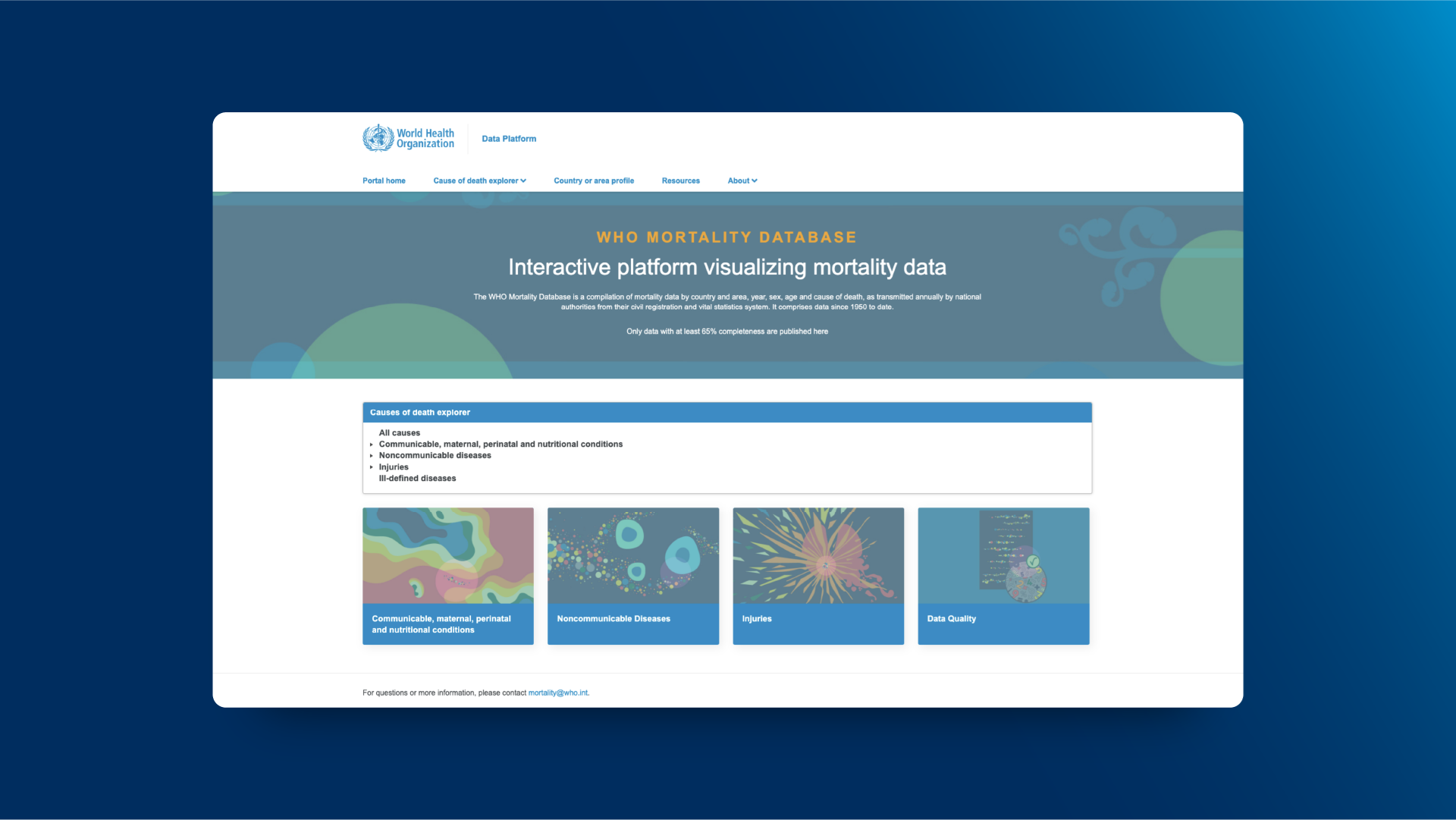
The new homepage of the WHO Mortality Database, inviting users to explore 70 years of global mortality data.
The mortality database: New additions and functionality
Today, the WHO Mortality Database contains seven decades of data from over 120 countries and areas, with deaths reported by cause, year, sex, and age. Previously, the database could only be accessed by academics and researchers with sufficient technical literacy. Now, for the first time in its history, this database and the possibilities within it will be freely available to everyone.
Not only does this new interactive portal present data by sex and age group, it gives users a significantly enhanced ability to filter and analyse this data by many different categories. For example, users can compare the number of deaths caused by different types of cardiovascular diseases for any given age group. Furthermore, they can compare this breakdown to other types of diseases.
Interactive visualizations also help to make the data more easily understood and used. In most visualizations, it is possible to change the way in which the data is presented, including by number of deaths, death rates per 100 000, or as a percentage of total deaths.
Bubble plots give an overview of a country’s burden. Bar charts allow users to compare the leading causes of death over time. And colour-coded heat maps can reveal global trends at a glance.
One of the key benefits of disaggregated data – data broken down by sex and age – is that it can also reveal deeper, unseen inequalities. For example, when a country shows large differences in male and female cause-specific mortality, this may be due to discriminatory practices against females.
By allowing us to easily examine trends and measure gaps, the WHO Mortality Database enables us to identify how Member States are performing in terms of inequalities. This provides powerful information to improve policy design and reduce both within and between-country inequalities which have been exacerbated by COVID-19.

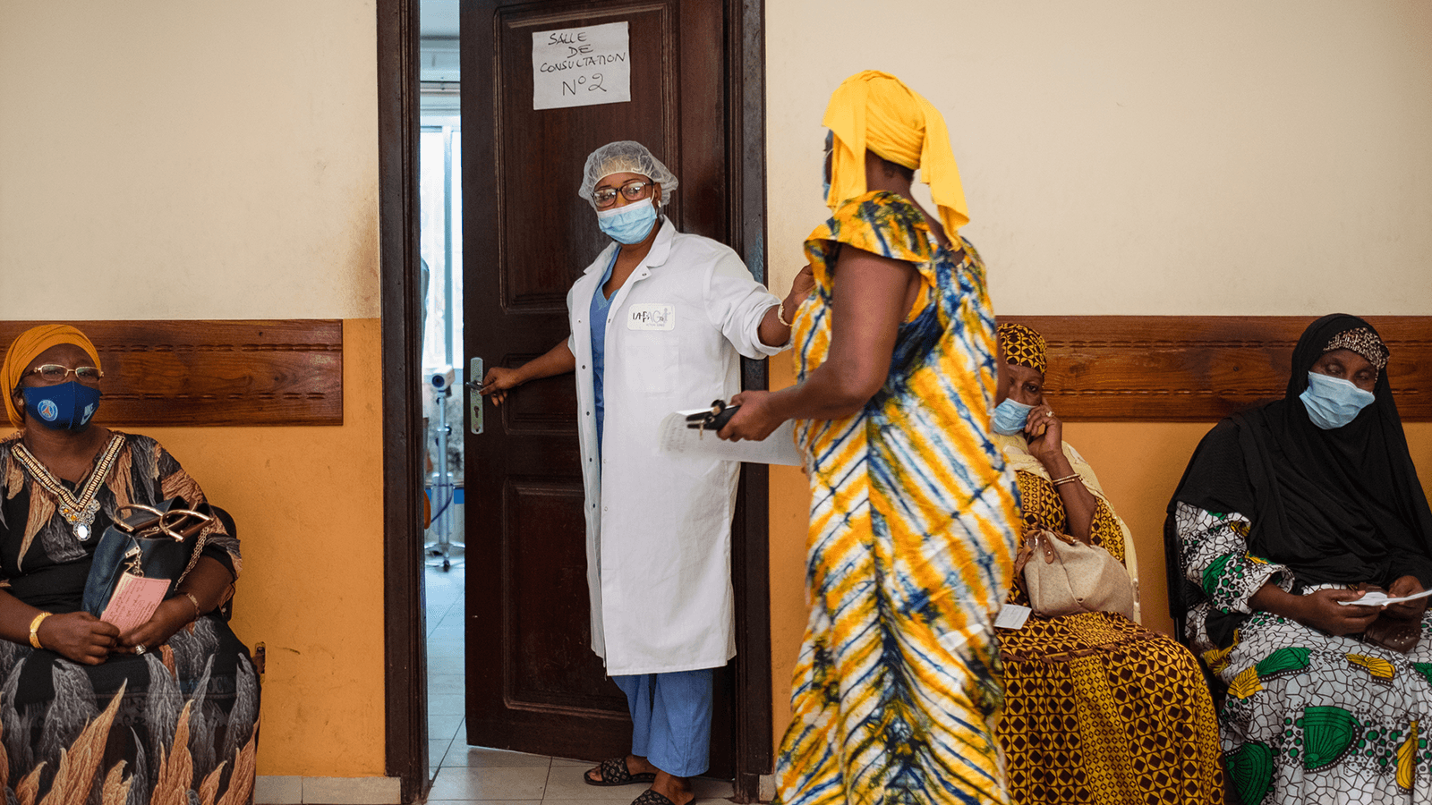
Patients at Donka University Hospital in Conakry, Guinea, which provides training to improve African countries’ capacity for screening and treatment of cancer.
Stories from the data: Epidemiological shifts
Perhaps somewhat counterintuitively, this mortality database is really a living portrait of a century of global health. Visualized and made more accessible, the data reveals many changes in the global epidemiological state since the mid-20th century.
For example, from the 1960s there were sustained international efforts to track and combat infectious diseases. This period is characterized by improved health and changes in the causes of death. Mortality from infectious diseases was progressively replaced by mortality from chronic and degenerative diseases, along with accidents.
Mexico: breakdown of total deaths by cause

Note: Communicable diseases include maternal, perinatal and nutritional conditions.
We can see this illustrated in the example of cause-of-death data from Mexico. In 1977, there was a visible shift where more deaths were attributed to noncommunicable diseases compared to communicable diseases. In addition to this health transition, deaths from injuries increased from 7% in 1970 to 15% in the 1980s alongside economic growth as well as increased traffic and homicide rates. Improvements in medical diagnosis and certification of the causes of death as well as in coding practices also led to a decline in deaths from ill-defined diseases falling from 13% of total deaths in 1970 to just 1% of deaths in 2020.
However, in 2020 the unprecedented mortality shock caused by the COVID-19 pandemic provoked a disruption in the trends. As a result, deaths from communicable diseases increased substantially.

People walk through traffic on a busy road in Tunis, Tunisia.
Stories from the data: Preventable deaths
Not only is there a need to identify the diseases and injuries that contribute most to mortality, but we also want to know how much of this loss of life can be prevented and at what cost.
Particularly when visualized, data in the WHO Mortality Database can reveal many insights about preventable deaths – and the effectiveness of measures taken against them. We can see this clearly in this example of road traffic deaths in France.
France: road traffic deaths

Road traffic deaths were rising steeply during the 1950s and 1960s. But France combatted this by implementing a series of safety policies with each passing decade: compulsory seat belts for front-seat drivers (1970s), Anti-lock Braking Systems (1980s), compulsory seat belts for back-seat passengers (1990s) and banning mobile phone use while driving (2000s).
Mortality data instantly shows the effect of these preventative measures, with road traffic deaths making an immediate and steady decline from the early 1970s onwards. Today, despite increases in both population and road traffic, France experiences fewer road traffic deaths than it did in 1950.

A campaign to raise awareness of the harmful and deadly effects of tobacco use and second-hand smoke exposure in Indonesia.
Stories from the data: Tobacco mortality
These mortality patterns – making visible cause and effect for numbers of deaths rising and falling – are a vital opportunity to learn from history. The case of tobacco use and deaths due to lung cancer is another illustrative example.
Lung cancer deaths per 100 000 people

Note: Age-standardized death rate.
In a world-changing study, Sir Richard Peto and his co-authors used disaggregated country-level data from the WHO Mortality Database to estimate total mortality attributed to tobacco smoking in developing countries.
“Back in the 1990s, people didn’t realize how many tobacco deaths there were,” says Sir Richard Peto. “The WHO Mortality Database enabled us to use the lung cancer rate in each country as a marker of how hard that country is being hit by tobacco. It also gave us a guide as to what fraction of the heart attack deaths, the stroke deaths and the lung disease deaths could be put down to smoking.”
According to Peto, the WHO Mortality Database has been crucial to getting the first truly reliable estimates of worldwide tobacco deaths. “And it’s allowed us to make warnings about what will happen in this century if people keep on the way they are,” he says.
Peto is currently Professor of Medical Statistics and Epidemiology at the University of Oxford and says that the WHO Mortality Database remains in constant use by teams at Oxford. “Not only in publications, but also in trying to understand things in discussion within the group,” he says. “It’s at the back of all our thinking.”
Conclusion
The benefits of better mortality data, supported by the launch of the WHO Mortality Database new visualization portal are impossible to overstate.
We can link data and statistics with policies and public health actions. We can share best practices from countries that have complete data sets. We can reveal the many changes in causes of death across a century of global health, from infectious to chronic diseases.
Yet even today, in many parts of the world – most particularly in low-income countries – death registration systems function sub-optimally, with 4 in 10 of the world’s deaths remaining unregistered. In February 2021, the SCORE global report 2020 highlighted the urgent need to strengthen these systems to help the world better respond to health emergencies and track progress towards global health goals. The WHO CRVS Strategic Implementation Plan 2021-2025 is an ongoing effort with partners to support countries in improving their CRVS systems. This is just one of the many steps the Organization is taking to address this gap.
The role of the WHO Mortality Database in improving population health is even more relevant in the context of the current pandemic. And from April 2022, it will allow this essential data to be explored more deeply, by more people, than ever before. “We need good mortality statistics,” says Sir Richard Peto. “Mortality statistics shouldn't be treated as confidential information. They ought to be in the global public domain. The world needs data sharing. And this is a great example of data sharing.”
